Wow, it’s been a month. Things have been crazy at work lately, but they’re settling down a little now. As a result, I can finally put up the rest of the update I started more than 60 days ago (wow).
What is not Fun in Multiplayer
Incredibly long view distances
This was covered a bit in the “cover” section, but it is important to break up long views with cover. Failing to do so reduces the importance of skillful close combat and increases the importance of “fire and forget” splash weapons and long distance sniper weapons. It also makes large open areas less useful as good “risk/reward” areas.
Linearity
The ability for players to choose their own routes, lines, and flows is essential to good multiplayer gameplay. Extreme linearity is a barrier to this and should be avoided except in the case that you want to present a “risk/reward” scenario.
Unassailable ambush spots / sniping positions
Sniping and ambushing people is a lot of fun. However, being on the receiving end of either of these things is not fun at all – especially if you can’t stop it from happening. To that end, sniper and ambush positions should be carefully placed and balanced. Any unassailable position should either be opened up or removed from a good multiplayer map.
Secret areas
While secret areas are fun to find in single player, every attempt should be made in a multiplayer game to remove intimate map knowledge as a major determining factor for victory. Secret areas, especially those with very potent powerups or weapons, encourage intimate map knowledge or hiding to the detriment of skillful combat.
Creating a Multiplayer Level
Determine Requirements
Does it need to be symmetrical?
Objective-based modes, such as Capture the Flag, are usually well-served by symmetrical maps. It’s very difficult to balance non-symmetrical objective-based maps, but it’s definitely possible.
What kind of level is it? Natural, alien, man-made? Is it a city? What kind of assets will you be using to make it?
By establishing this early on, before you do your first maps or blockouts, you can get a head start on what basic shapes you’ll want to use to construct your map. While it’s tempting to jump right into construction or mapping, I’ve seen plenty of maps get ruined because not enough thought went into this part of the process.
Does it need to support multiple modes or game sizes?
In Resistance: Fall of Man, most of our maps were constructed to take advantage of different player counts and game modes. Because we had to balance these maps for so many different variables, we made a lot of choices to ease in the balance process. That’s why most of the resizable maps were symmetrical, for example.
Choose your Areas
I define an FPS multiplayer level as a connected series of “areas”. A good area area is any space which:
a) Has a focal point,
b) Is a good space for 4-8 players to fight,
c) Contains a good amount of terrain choices (like verticality), and
d) has at least 2 (preferably 3) entrances / exits.
Choose Focal Points
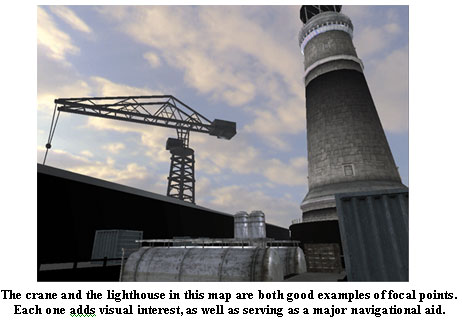
When thinking of focal points, you need to think of them in two scopes: Area focal points and Map focal points. Both serve the same twin purposes:
1) To serve as navigational aids and landmarks for the area / map.
2) To provide a gameplay and artistic focus for the area / map.
Focal points also tell the players what an area is. “The Lighthouse”, “the base”, “the cave”, or “the docking bay.” Each of these gives you an idea of what it basically is, and what a focal point might be. For example, the docking bay may have a space ship in it that you fight on or around, while the lighthouse is pretty self explanatory.
Here’s a number of guidelines that I found useful in constructing maps for Resistance:
- Every map should strive to have one major focal point that the whole map is based around.
- The focal points must serve to add visual interest and to drive players towards a goal.
- Focal points can be gameplay objectives, structures, powerups, etc…
- The best multiplayer “spaces” are built around a focal point that attracts both visual AND gameplay interest

Determine Flow / Connectivity
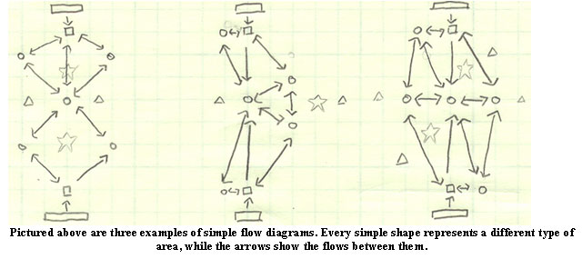
A good first step when starting a Multiplayer design is to create a simple flow diagram. A flow diagram is simply a series of simple shapes representing areas (squares, circles, triangles, etc) with arrows between them which represent connectivity. You may remember me talking about these in a previous article. I called them “Bubble Diagrams.”
Pictured above are three examples of simple flow diagrams. Every simple shape represents a different type of area, while the arrows show the flows between them. Keep in mind that these arrows only indicate flow. They don’t necessarily convey any information about number of entrances, exits, or anything else.
When thinking about flow, it’s good to consider the following:
- Global flow (pickup placement)
- Local flow (focal points, terrain advantages)
- Think about how to best encourage the player to make good decisions
- Entrances / exits (every area should have at 2, but preferably 3)
- Good deathmatch maps connect everywhere to everywhere else
- Good node / CTF maps strategically block off some connectivity (to make chasing your opponents or defending objectives more possible)
Begin Roughing out the Areas
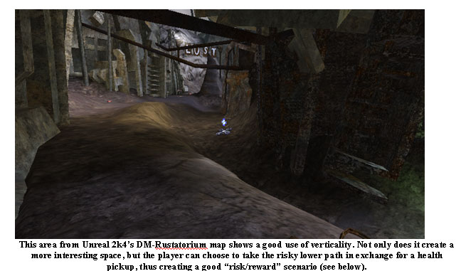
Now that you’ve got your flow down, it’s time to start roughing out your areas. This can be done on paper or in 3d, as suits the individual designer. When coming up with gameplay for these areas, it’s good to begin considering the other aspects that make up an area. Most important of all, however, is to add verticality.
- Verticality is important!
- Adds visual interest
- Good re-use of space
- Fit more gameplay into smaller footprint
- Gives players interesting choices
You’ll also want to start thinking about things like view distances, how good you want your various spaces to be for camping, or what (generally) you want the gameplay to be in those areas.
Open Space Vs. Covered Spaces
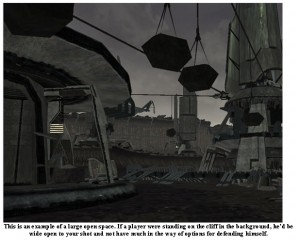
In general large open spaces should be avoided in favor of spaces with lots of cover and/or verticality. The exception is when you want the player to be vulnerable, such as when creating a risk-reward scenario
Risk / Reward Scenarios
A good way to encourage players to make choices is to place a few “Risk / Reward” setups into your areas. These are any time you want to tempt the player into taking a big risk to obtain some big reward. An example would be a powerful weapon in a vulnerable spot (such as on a small beam, or in a large open area, or near a wall).
Other times you can tempt a player with an eventual strategic advantage. For example, you could place two paths leading into a base – one has good cover and excellent spots to attack the defenders. The other has a short patch that is open and easily defended, but leads to some good high ground you can use to further demolish your opponents.
A Few Extra Notes
CTF Support (Symmetry)
- CTF and Node modes almost require symmetry to achieve balance.
- CTF requires that the flag carrier have good places to run, but not to hide
Useless Spaces
- Sometimes you will have places in your map that a good player will never go, since it only gives them a disadvantage. Try to avoid this, whenever possible.
- If you find, through testing the space, that a part of the map is useless space, try creating a risk/reward scenario there. Put a pickup there or create some other reason why it’s a good place to have. Failing that, block the area off to keep newbies from having enough rope to hang themselves.
FPS-Specific Tidbits
- Avoid extreme changes in terrain grade. Not only do they look too steep to walk up, but they are also pretty hard to see when walking towards them. More gentle grades will often be more obvious.
- When designing corridor style spaces (Pathways, valleys, streets), determine the minimum amount of space needed for the game play you are intending on before designing these area.
- If possible, strive to use to already built (to-scale) assets when roughing out a 3D space. This can give you a good idea of whether or not a space you designed is going to be big enough once it has been populated with art assets.
Player Map-Knowledge
While knowing a map well is a key to attaining vicory, in general it should not be an incredibly important arbiter of who wins or loses. Skill with the core mechanic fills that role.
Knowledge of the map as a determining factor of who wins the map is a bad thing when you have:
Secret areas – Secret areas allow flag holders to hide in CTF, and reward map knowledge over skill contests.
Powerful hidden pickups – Only people who have played the map will know where to get these. In general, place your most powerful weapons in easily accessible places and use them as focal points.
Hard-to-find gimmicks – Things like buttons hidden in the level that call in airstrikes make everyone else explode. These can be cool when they’re in an easily accessible area and provoke a gimmick that you have some countermeasure against, but not when hidden or secret.
Teleporters (sometimes) – Teleporters in general discourage fair fights, since only those with knowledge of where they go can make good decisions on coming out the other side. Teleporters can be good in some instances, but unless you really have some really good gameplay in mind, there’s usually a better solution


*speechless*
What an awesome read! It’s very interesting to have a true design-insight in level/map design.
Thanks, Cron!
Great post as always Dodger, I really enjoy reading your blog. Hopefully you can update more often.
Thanks RedHawk. I’m going to try. I’ve been falling very far behind with it due to work craziness. Things are settling down a *little bit* so hopefully I’ll blog every so often. Even if it’s nothing that insightful 😉